
My Role
Product Designer & User Researcher
User Research, User Flows, Rapid Prototyping, Interaction Design, Visual Design
Team
1 PM, 3 Engineers, 2 Data Scientists
Collaborated with 2 consumer researchers, the safety and security team, and the legal team
Overview
We create a new swipe state feature based on users’ low-pressure engagement needs by implementing minimal but impactful UX and content changes.
I led the end-to-end design direction of the mobile experience for enabling users to a new state option experience and played a pivotal role in defining the from research to design.
Result
This resulted in a 2% increase in likes sent per female user, boosting session duration and interactions among female users, fostering a healthier ecosystem. Additionally, the feature was integrated with the revenue system, driving an increase in Average Revenue Per Unit (ARPU).
User
2% ↑
likes sent per female user
User
longer
session duration
System
healthier
Tinder ecosystem
Revenue (estimated)
boosted
Average Revenue Per Unit
Highlight
Sample UI pages


Core component catalogue.

Context
It’s supposed to be dating, but it feels like job hunting!
The dating app is high-pressure and in a funnel that we can feel.
Profile
Swipe
Chat
Date
Perfect Resume
Cover Letter
HR Round
Job Interview
Then we have the original and simple goal:
Help users release stress when using Tinder.
Discovery
Dating app stress affects both sides of users, but in different ways.
When users swipe on Tinder, there are two roles: swipers and swipees.
Swiper
who view profiles and swipe to decide “yes” or “no”
Swipee
who are the ones being swiped on (chosen)
Initially, we thought Swipees experienced more stress, being rejected or judged one-sidedly.
Swipees struggle with waiting and the emotional impact of rejection.
Swipee’s Journey: Wait for Approval, Feel Judged, Fear Rejection

User Need - Swipee
More positive feedback
Feel seen through more positive signals.
However, after initial research, we found that’s not the case; swipers are also struggling on the other side.
Swipers feel stressed by the pressure to make instant decisions, leading to hesitation and regret.
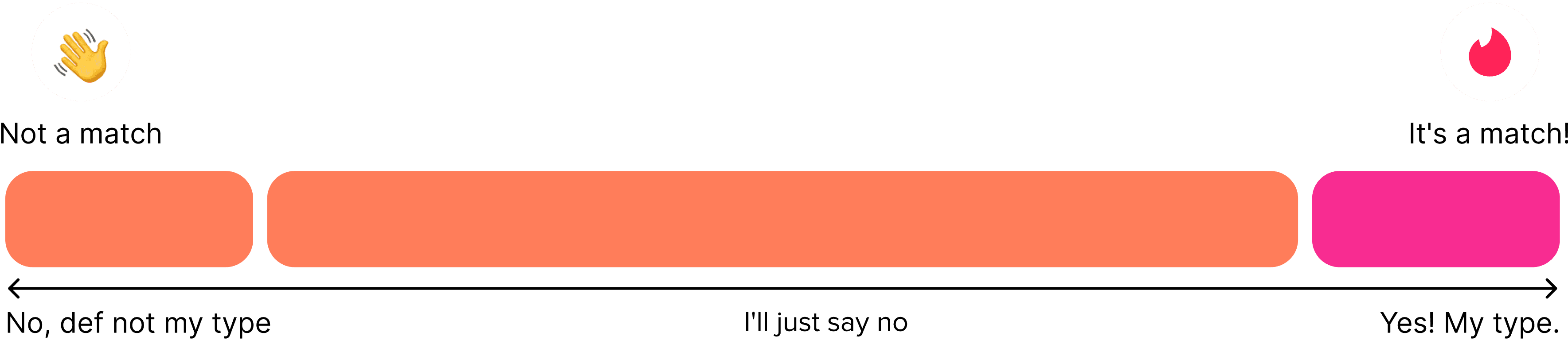
It takes five times longer to say “no” than “yes.”
Swiper’s Journey: Struggle to Decide, Overthink, Fear Regret.

Swiper’s perspective during swiping
Whole option spectrum: from No to Yes

What we thought:
If users don’t like the profile that much, they will say no; If users kind of like the profile, they will say yes.

But it actually is…
Other than “Yes, my type!” users swiping right, they just struggle and then all say no! 💧
User Need - Swiper
Less pressure, More possibilities
No need to decide on every profile right away.
Softer signals beyond yes/no — especially appealing to female users.
We can’t change the Swipee’s profile to match the Swiper’s preferences, but we can change how Swipers perceive the Swipee.
HMW
Open up more possibilities & lower the pressure of decision-making for Tinder users?
initial ask
Define
Company
More user engagement
More touchpoints to interact.
More chances to match.
User - Swipee
More positive feedback
Feel seen through more positive signals.
User - Swiper
Less pressure, More possibilities
No need to decide right away.
Softer signals beyond yes/no.
Hypothesis
What we can do according to the swipers’ spectrum?
Sub-HMW
Change a definite “No” to a softer “No”
Hypothesis 1: For Swipee
Transparent Metrics
——Solving Digital Ghosting
Problem:
Gen Z users face high social anxiety and mental stress on dating platforms.
Current apps lack mechanisms to promote responsible communication.
Users often feel rejected or emotionally drained by inconsistent communication patterns.
Hypothesis:
We believe that implementing a transparent user engagement profile, showcasing interaction patterns and accountability metrics, will encourage positive behaviors and reduce ghosting among Gen Z users.
Solution:
Proposed new card
User activity card
My activity
Chats with matches
46% of time
Sends first message
21% of time
Active within 72 hr
Yes, active
Replies within
12+ hr
View all 6
Current cards
Interests card
Interests
Painting
Photography
Coffee
Dungeons & Dragons
Parakeets
Animals
Crochet
Peloton
Motocross
Cooking
Baking
Museums
Indie
Running
Information Card
My weekends
My weekends are for
🔋
Recharging
My ideal Saturday nights look like
🛋
Cozy night in
My typical Sunday looks like
💆
Self-care
Matchmaker card
Matchmaker
Your friends Angela, David, Penelope and Lola recommend Sam for you.
Following the hypothesis, we collaborated with consumer researchers and users to evaluate the concept’s desirability and consulted with PMs and engineers to assess its development potential and feasibility.
Validation & Feedback:
UXR
Risk of User Discouragement
Features should avoid appearing as ego-boosting, overly effortful, or making users feel “uncool.”
UXR
Misaligned Usage Patterns
Users don’t use dating apps daily, so implementing reports may negatively impact user engagement.
PM
Increase Retention & Engagement
By encouraging positive interactions and reducing the stress of unpredictable communication, users are more likely to stay engaged with the platform.
UXR
Increase User Confidence
By providing transparency into communication patterns, users may feel more informed and confident when initiating or continuing conversations, reducing anxiety.
Hypothesis 2: For Swipper
Compassionate Rejection
——Adding meaning to No
Problem:
Dating apps create emotional distress by providing zero-context rejections, causing users to internalize negative self-perceptions and experience psychological harm through unexplained disconnections.
Hypothesis:
We believe users will reduce emotional distress by implementing a multi-dimensional rejection feature that provides kind, constructive reasons for non-matches, transforming rejection from personal judgment to compatibility insight.
Solution:
A multi-dimensional rejection feature that provides kind, constructive reasons for non-matches.
This shifts rejection from personal judgment to compatibility insights, reducing emotional distress and promoting a healthier, more positive dating experience.

Validation & Feedback:
PM
High Privacy and Sensitivity Concerns
Providing rejection reasons may harm privacy and risk misinterpretation, potentially causing emotional distress.
PM
User Experience Impact
Selecting a reason for every rejection feel tedious, leading to frustration and a negative overall app experience.
Engineer
Scalability Limit
Implementing a multi-dimensional rejection system might require significant backend work, especially if reasons are stored and used for personalized insights or analytics.
Engineer
Performance Impacts
Adding extra steps for each interaction may increase server load and impact app performance, especially during peak usage times.
PM & UXR
Middle-state option
User feel bad to reject on people, and this soft middle state release user pressure when swiping
💡 Key Turning Point: Binary Choices → a Middle State
Neither hypothesis fully fit, but we found a middle ground.
— a middle-state option that reduces stress for both Swipers and Swipees.
Iteration
Sub-HMW
Change a “Maybe No” to a “Maybe Yes”
Introduce a middle-state option by shifting from “maybe no” to “maybe yes.”
This change can reduce decision-making pressure for Swipers, increase opportunities for potential matches, and provide Swipees with more positive feedback. Ultimately, it enhances user engagement and fosters a more supportive and encouraging experience.
Option 1 : Long-press

Low discoverability
May conflict with other long-press actions
Familiar gesture
Hard to trigger by accident
Option 2 : Drag

Confusing gesture
Less accessible
Needs onboarding
Playful and interactive
Leverages swipe behavior
Option 3 : Gamepad

Adds UI clutter
Breaks swipe flow
Feels less “Tinder-like”
Simple tap interaction
Accessibility-friendly
Option 4 : Swipe Down

Intuitive swipe
Aligns with core UX
Encourages reflection
Might lead to accidental triggers if gesture isn’t precise
💡 Final Choice
Solution
As a designer, I first
explored design solutions to create a seamless middle-state experience.
Design - UX
Intuitive
Solution
Engaging UX feature interaction
Based on Tinder’s current interactions of swiping left, right, and up, we utilized the swipe-down gesture for the “Maybe” feature, keeping it intuitive and fun to use.
Design - UX
Informative but
non-disruptive
Solution
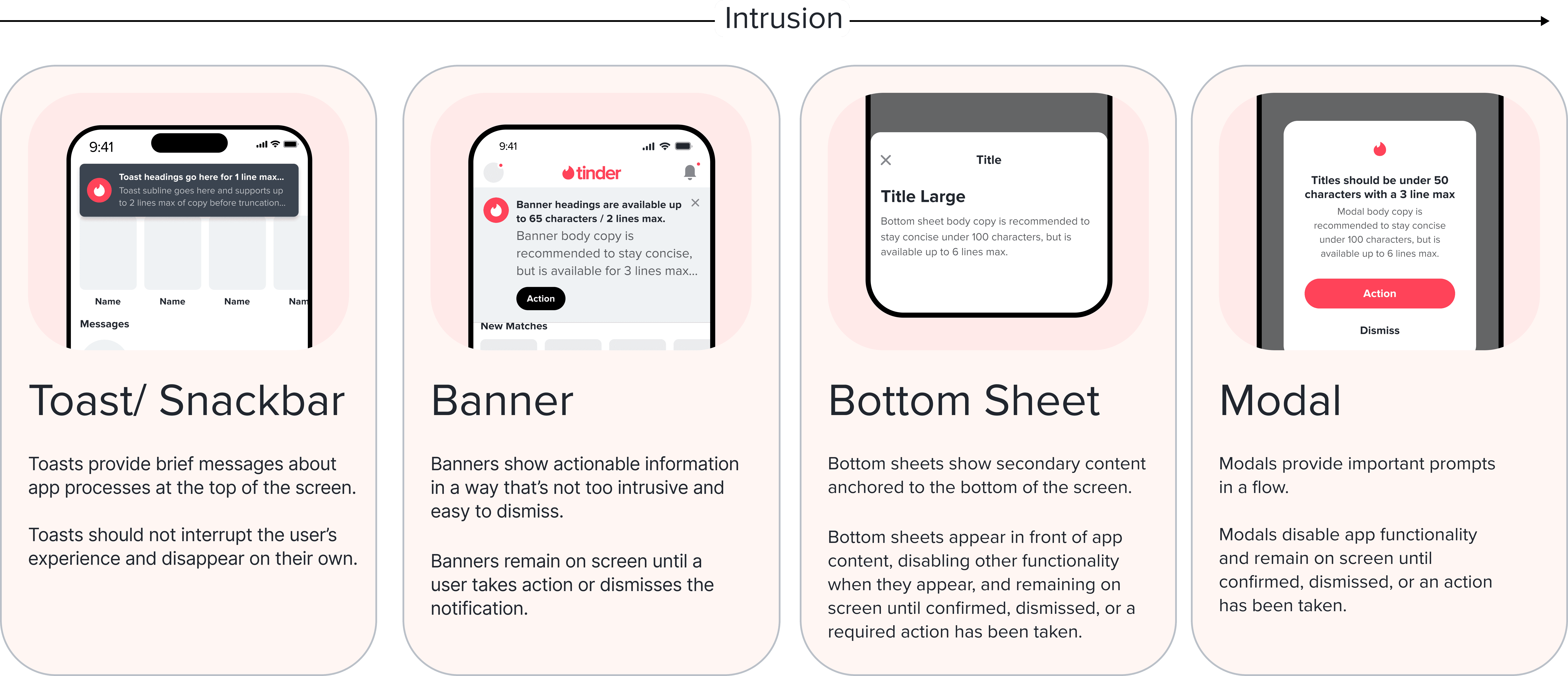
Proper notification choices for different scenarios
After drafting the design solution, I started thinking about:
How to integrate the feature into the Tinder ecosystem
while aligning with the business goal of increasing user engagement?
I then reached out to cross-functional teams to collaborate on implementation, ensuring the solution fit seamlessly within Tinder’s product strategy.
Stakeholder - PM
PM asks
How do we help the user change ‘Maybe Yes’ to ‘Yes’?
Stakeholder - PM
User engagement/
conversion
Solution
User - Swiper
Limit consideration time and MayBee numbers
We limit the number of MayBees and the time for consideration.
Users can only send up to 4 MayBees. Once a user sends a MayBee, the clock starts ticking, and they must decide whether to change it to a “Like” within the given timeframe.
Solution
User - Swiper
Gentle reminder as the deadline approaches
If the 24-hour limit is close, we’ll send a light notification to nudge the user: “Time’s ticking! Final call to make your decision.”
Solution
User - Swiper
Tinder’s pick to help with decision-making
If the timer expires and the user is still undecided, no worries! Tinder steps in with Tinder’s Pick:
We highlight similarities between both profiles to help the Swiper evaluate and make a more informed choice.
Solution
User - Swiper
Highlight MayBees and encourage engagement
In the Swiper’s gold homepage, among all the people who have liked them, those who like them back will be highlighted.
This encourages Swipers to swipe on mutual connections first.
Solution
User - Swipee
Notifications for receiving a MayBee
When a Swipee receives a MayBee, they’ll get a notification: “Someone sent you a MayBee! Click to check it out.”
If they miss the notification, they’ll see a badge on the Swiper’s profile, offering positive feedback and encouraging them to take the first move.
Stakeholder - PM
Product Architecture Fitting
Solution
Integrated user flows, more user interactions
With the MayBee feature embedded in the current user flows, both Swipers and Swipees have more options and interactions, while also adding more paths to final matches.
Stakeholder - Engineers
Adapt current developed components
Solution
Consistent design components and operations
Engineers value feasible designs, and by adapting existing components and following current design system guidelines (both UI and UX), we ensure alignment with current operations, design principles, and development processes, maximizing efficiency and ease of implementation.
Stakeholder
Revenue Team
Integrate with current ALC system
Solution
Purchase more MayBee spots
With a limit of 4 MayBee spots, users can purchase additional slots for better flexibility if needed.
Stakeholder
Safe& Security
Always under user’s control
Solution
Options for anonymous mode
Tinder always respects user privacy and gives users control. If a user wants to save a profile for later reference without others knowing, they can go to settings and enable anonymous mod
Impact
This resulted in a 2% increase in likes sent per female user, boosting session duration and interactions among female users, fostering a healthier ecosystem. Additionally, the feature was integrated with the revenue system, driving an increase in Average Revenue Per Unit (ARPU).
User
2% ↑
likes sent per female user
User
longer
session duration
System
healthier
Tinder ecosystem
Revenue
boosted
Average Revenue Per Unit
Problem Space
Impact
User - Swiper
High pressure when making decisions
User - Swiper
Lower pressure
More possibilities
User - Swipee
Not enough positive feedback
User - Swipee
More positive feedback
More potential to interact
Company
Limited user interactions and engagement
Company
Increased interactions and engagement New revenue stream
Reflection
Learn from What Exists
When designing something new, it’s essential to understand existing systems. Explore guidelines and interactions and analyze revenue streams to ensure innovation aligns with the product ecosystem.
Constraints Bring Clarity
The more limitations we face (whether from PMs, UXR, or engineers), the clearer our design direction becomes. Constraints help us prioritize, focus on essentials, and make impactful decisions.
Small Wins on Tight Timeline
In fast-paced environments, focus on delivering small, impactful, and cost-effective solutions that meet immediate goals and enable future improvements.